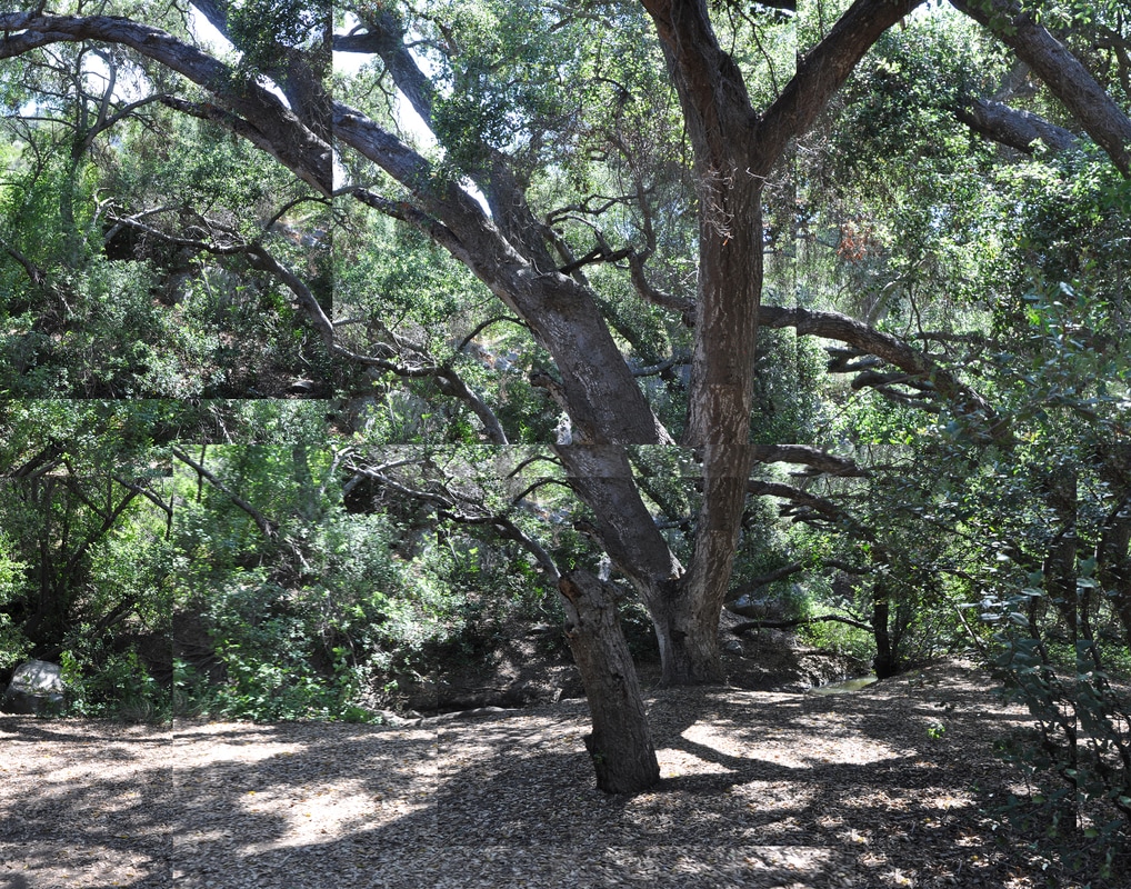
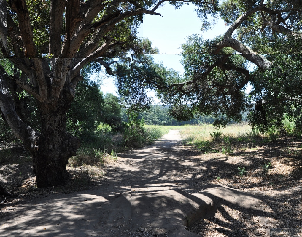
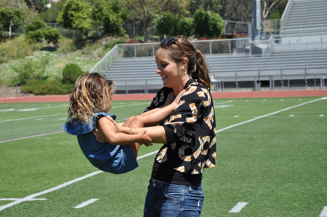
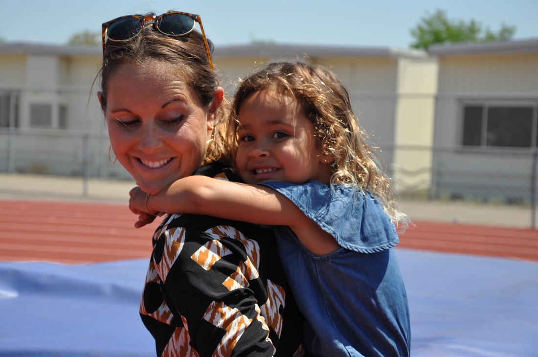
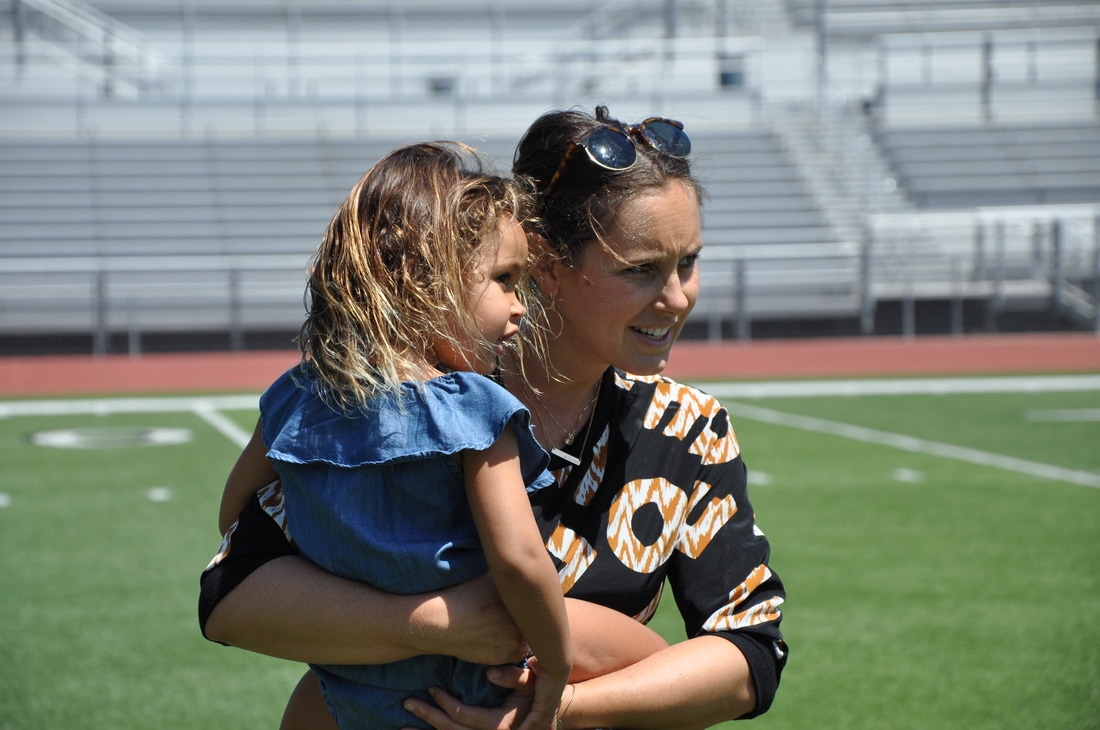
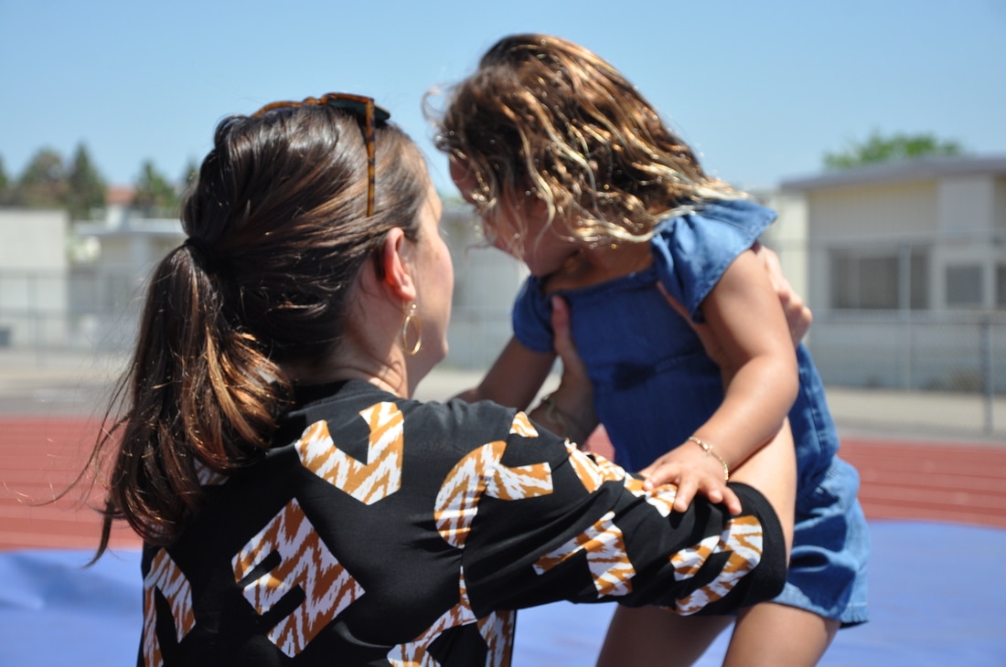
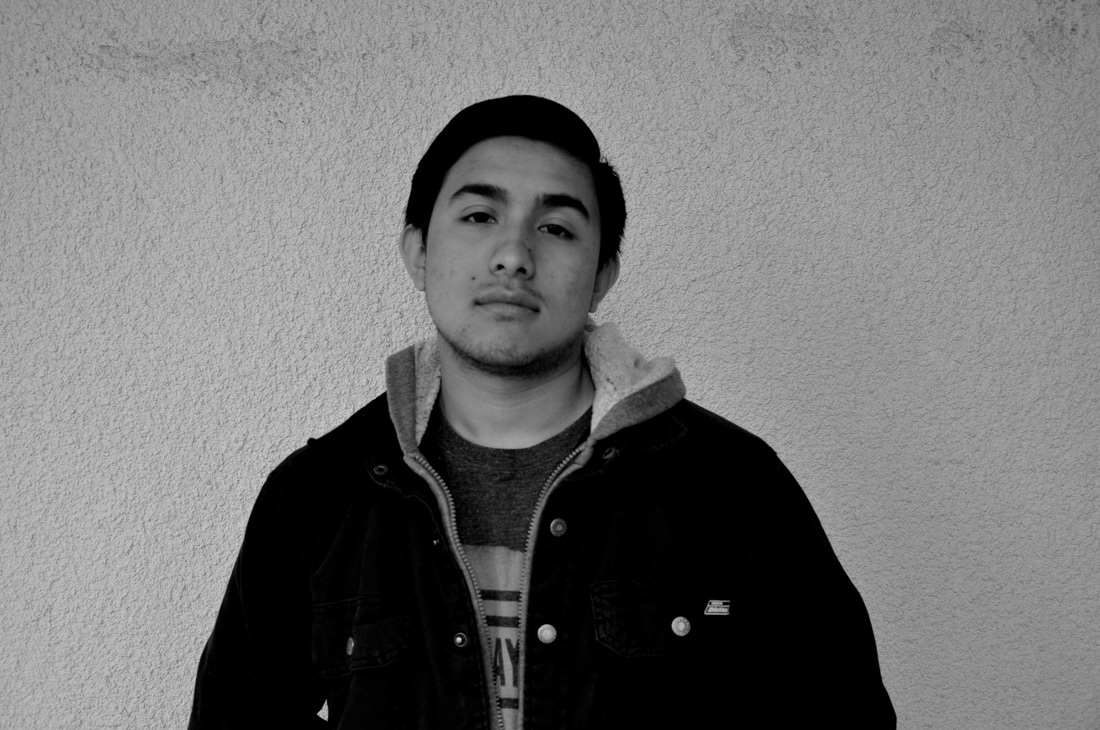
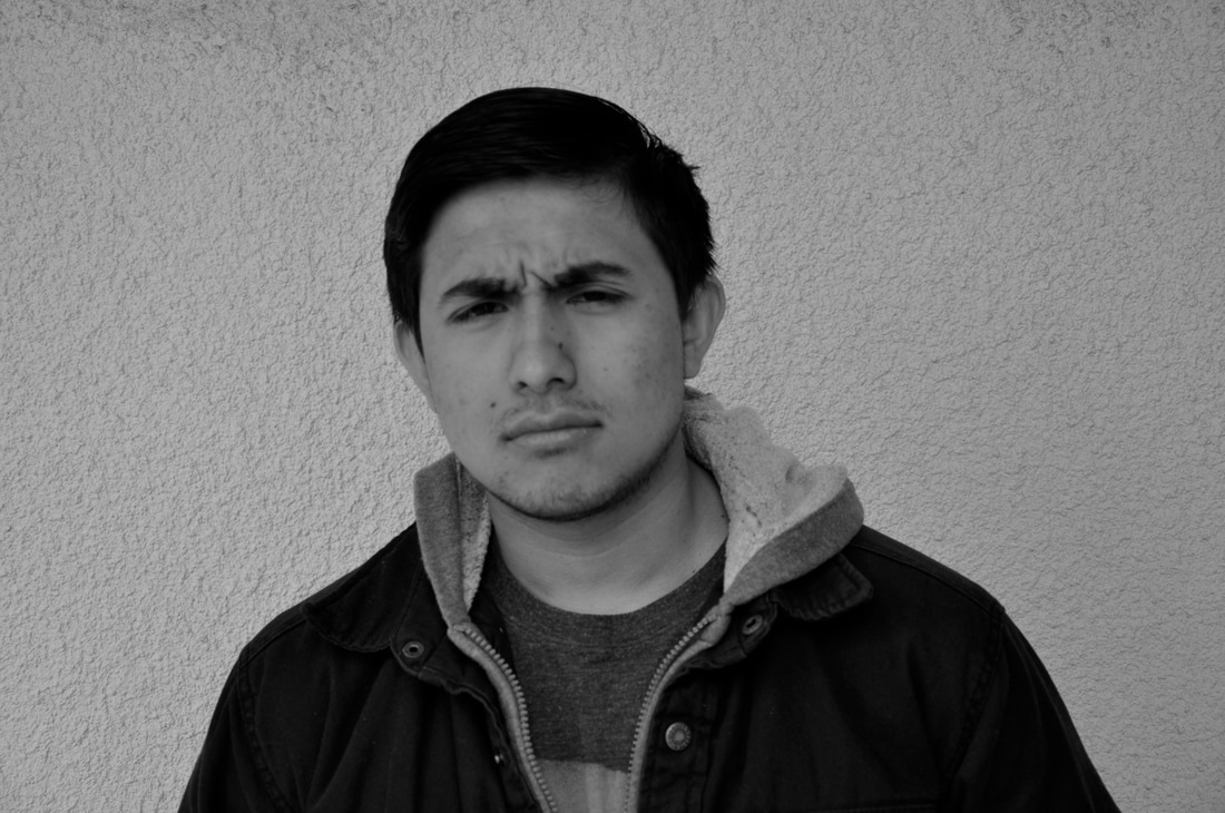
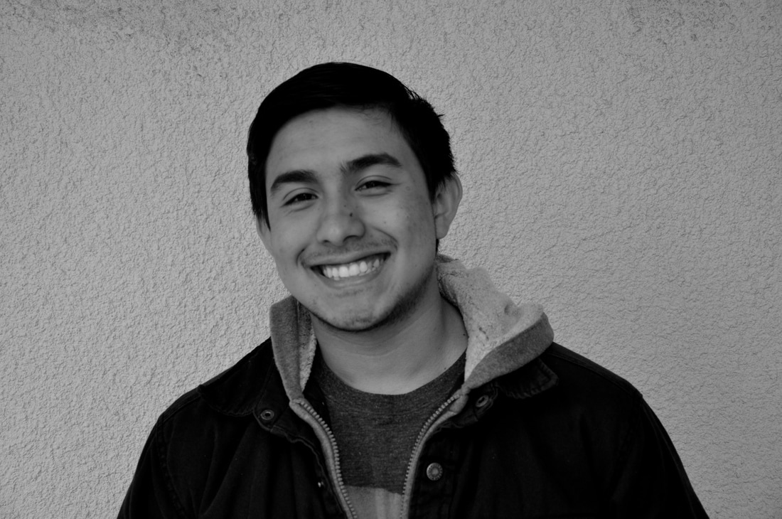
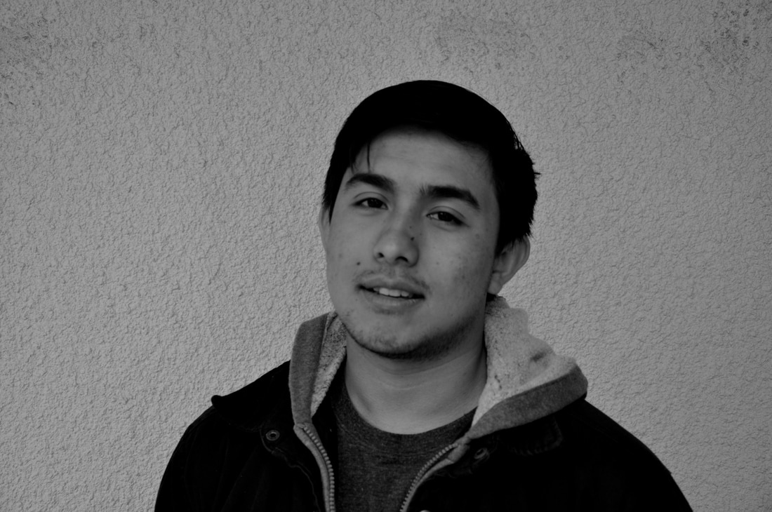
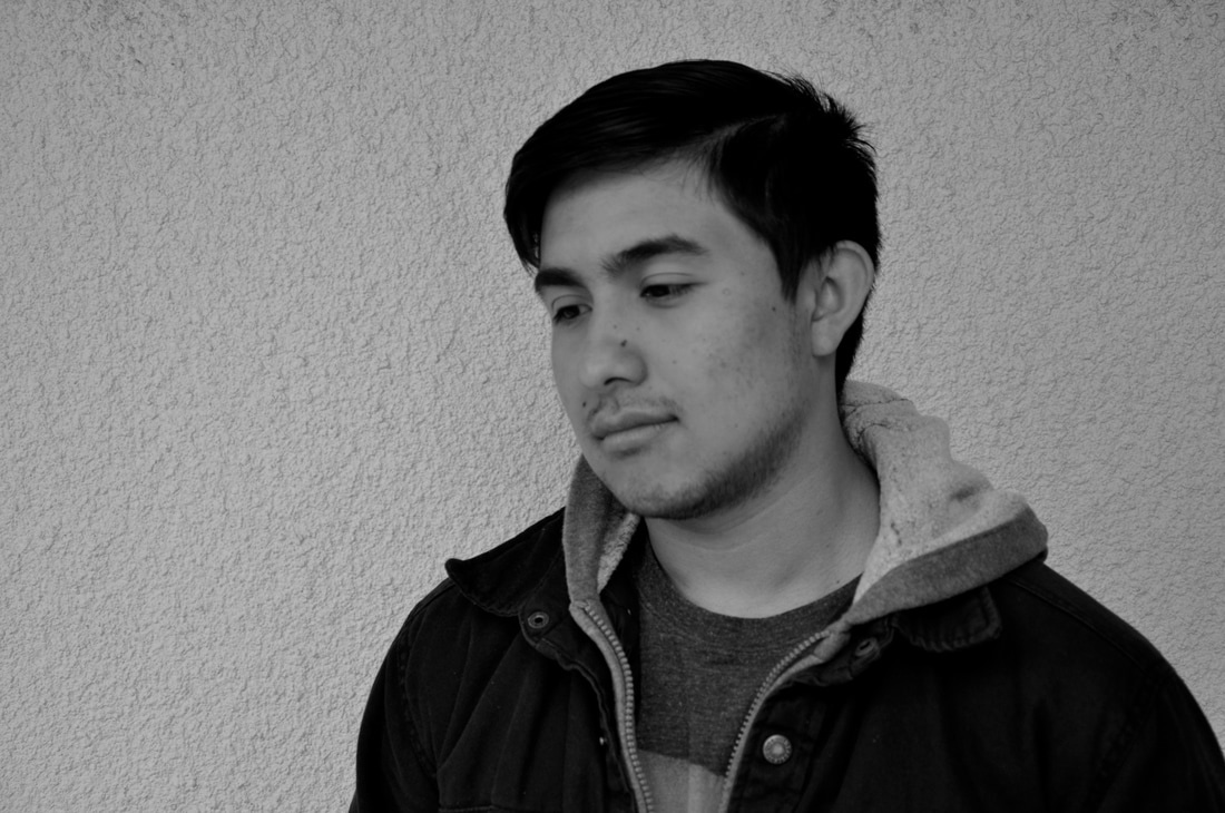
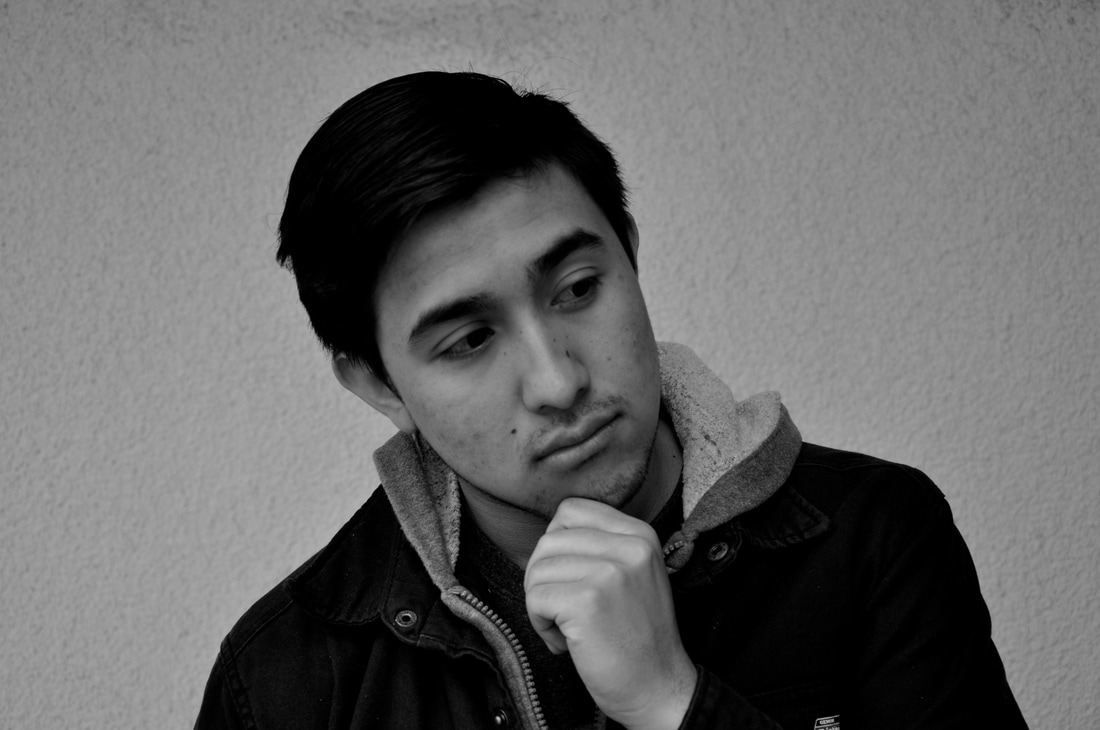
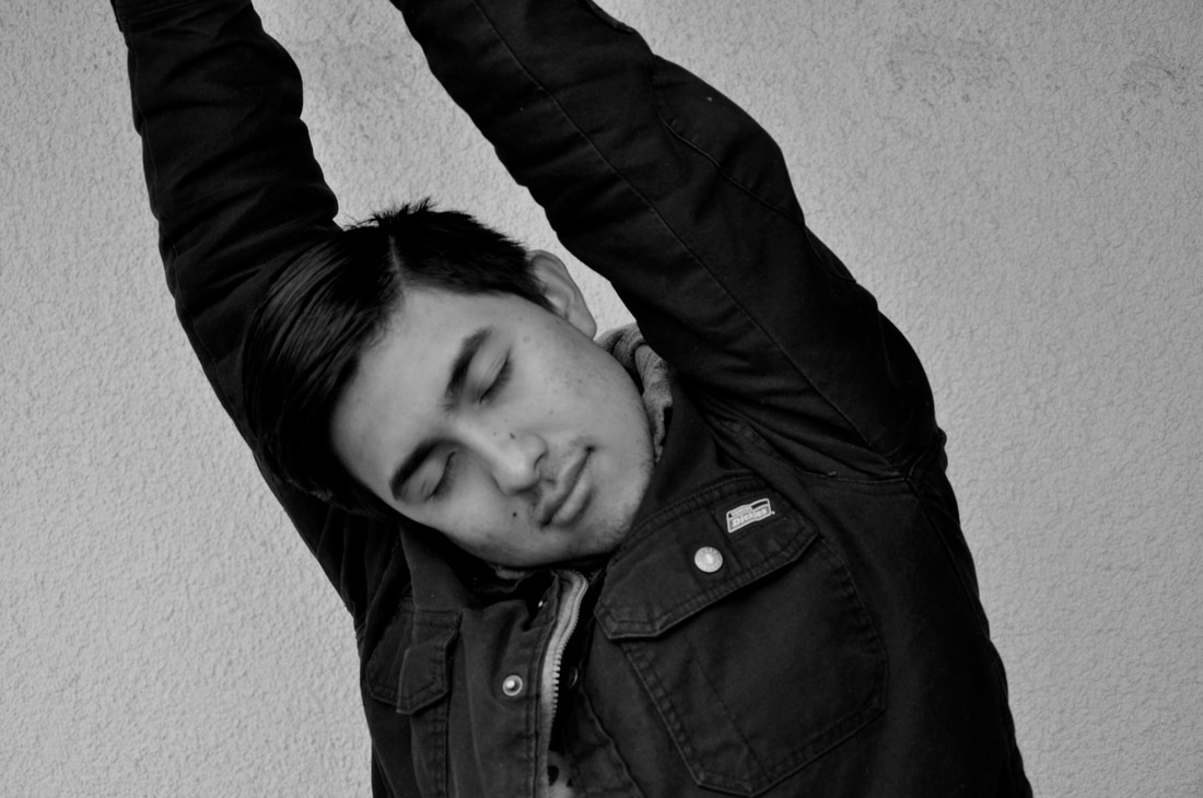
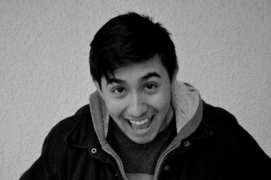
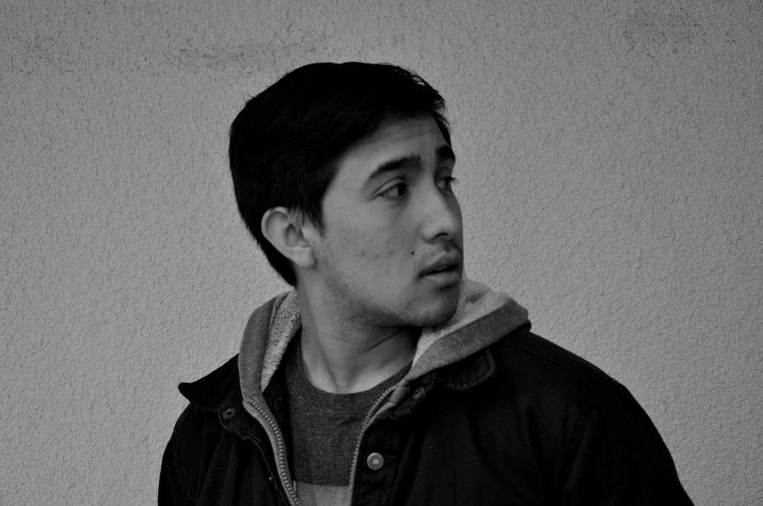
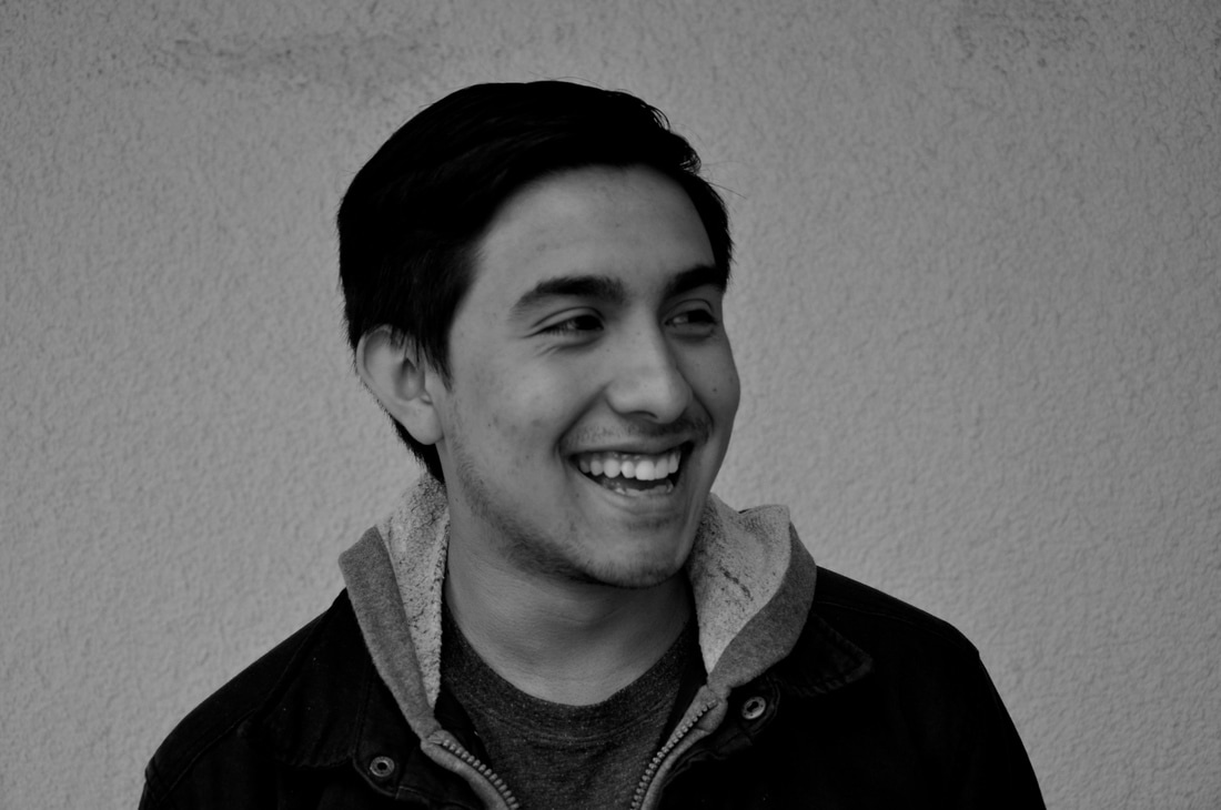
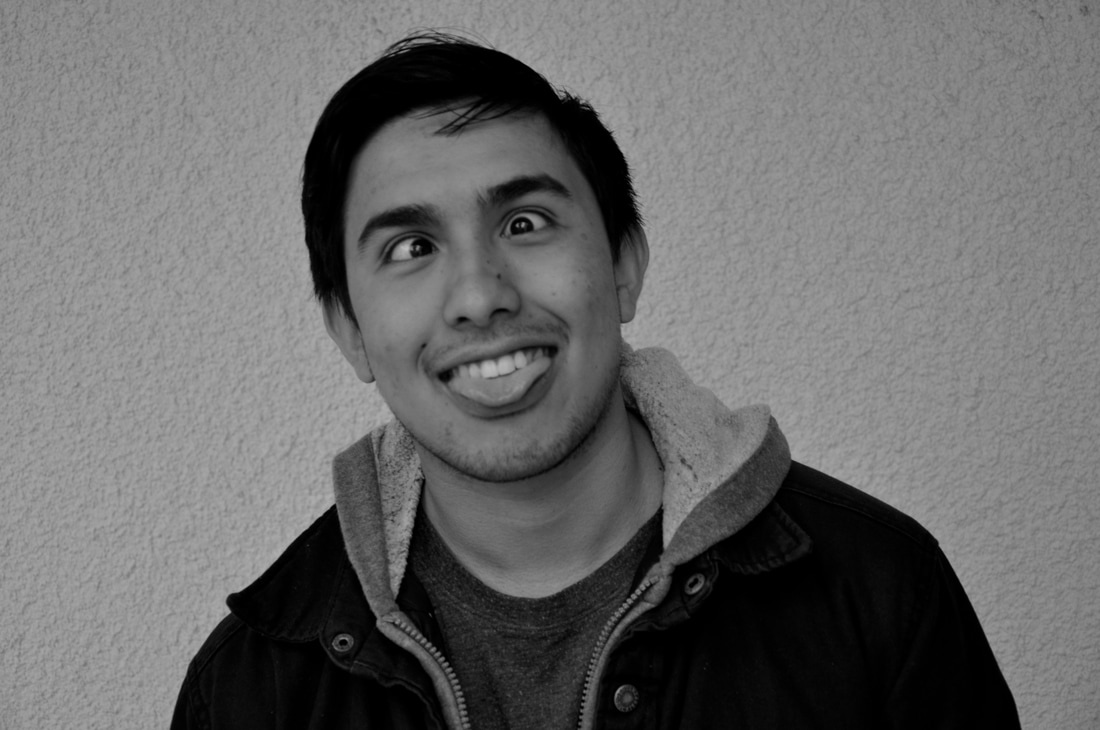
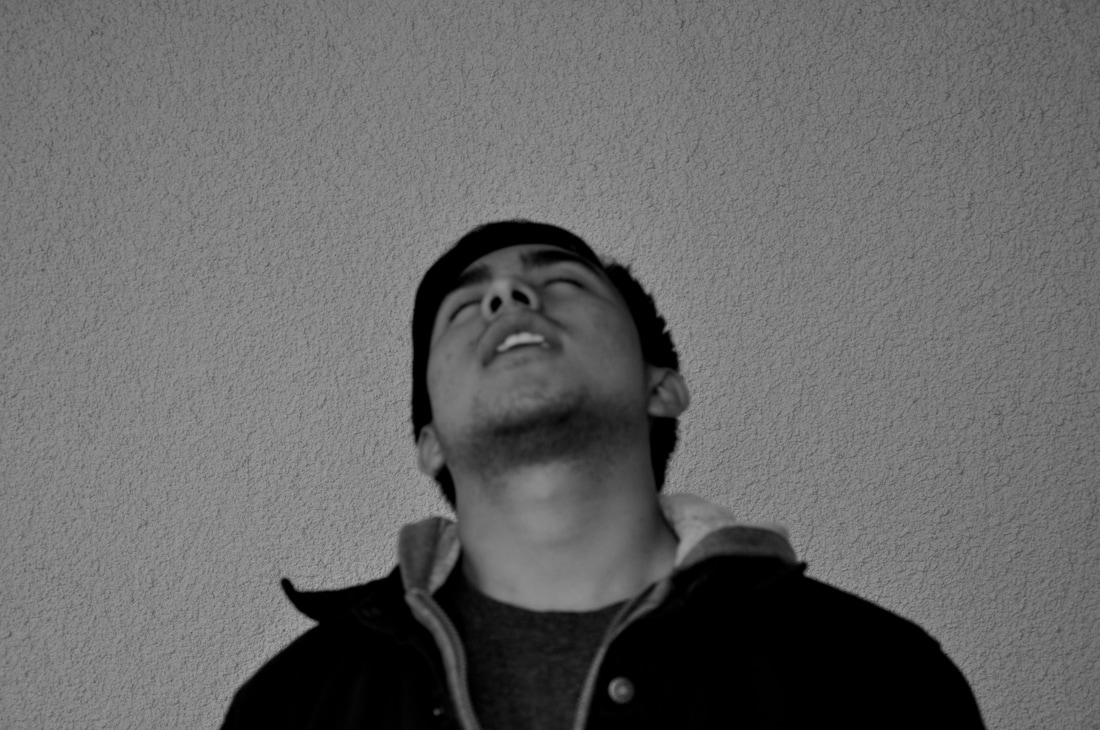
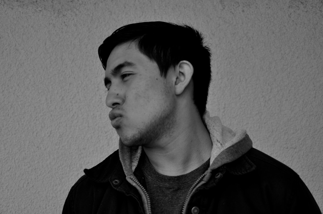
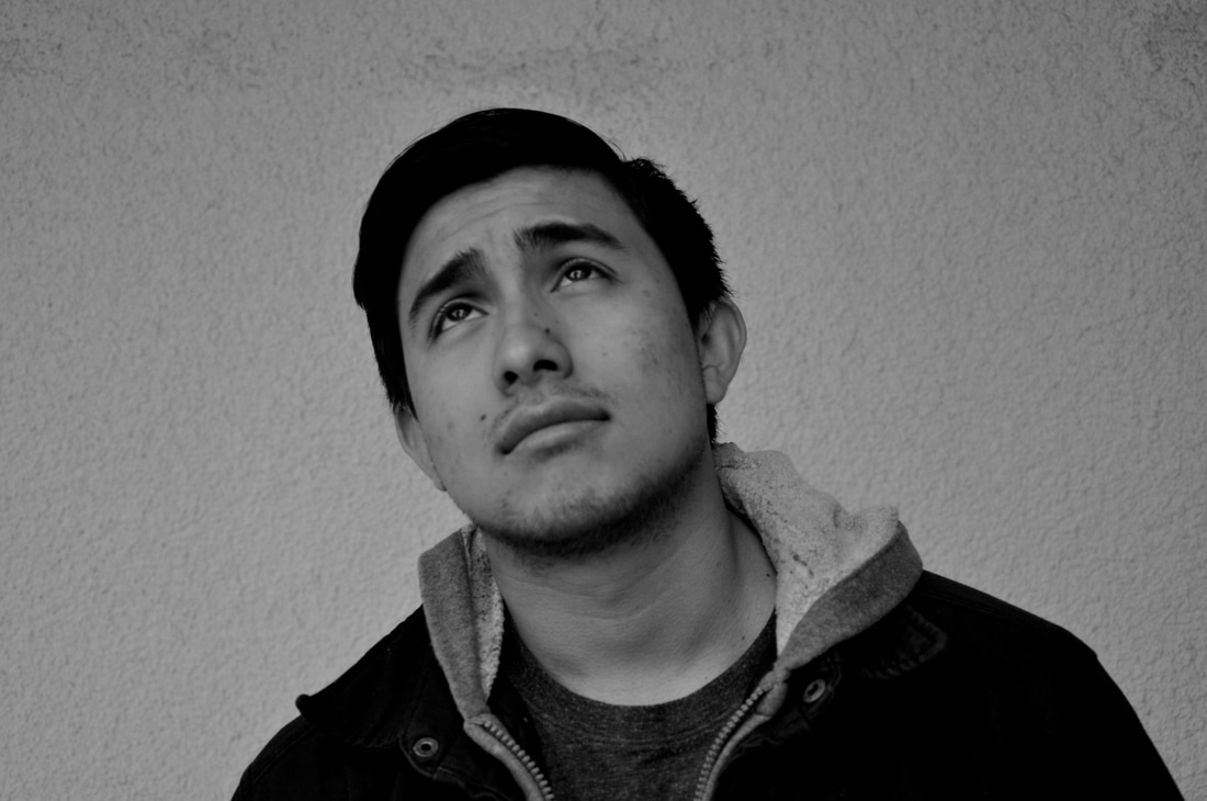
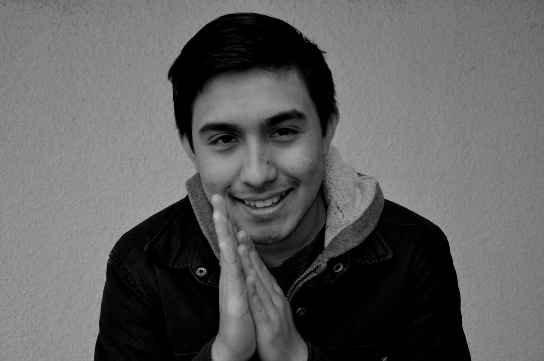
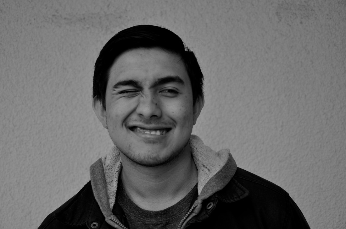
  These are photos inspired by David Hockney. Hockney is an British artist who is famous for paintings and photographs. David Hockney was born on July 9th, 1937, in Bradford, England. Hockney had homes in both London and California. This art work emulates one of his styles of photography because it is a bunch of pictures of one setting, then they are put together as if it were some type of puzzle.
To make this picture, I first took pictures. I found a setting I liked and I took multiple pictures of this setting. I took some zoomed in, some zoomed out, and all around the setting. Then after I uploaded them on my computer I opened up Photoshop. I then placed the images into photoshop and started to size them with "Command" "T" and hold down shift to desired size and placed the pieces as if it were a puzzle.
0 Comments
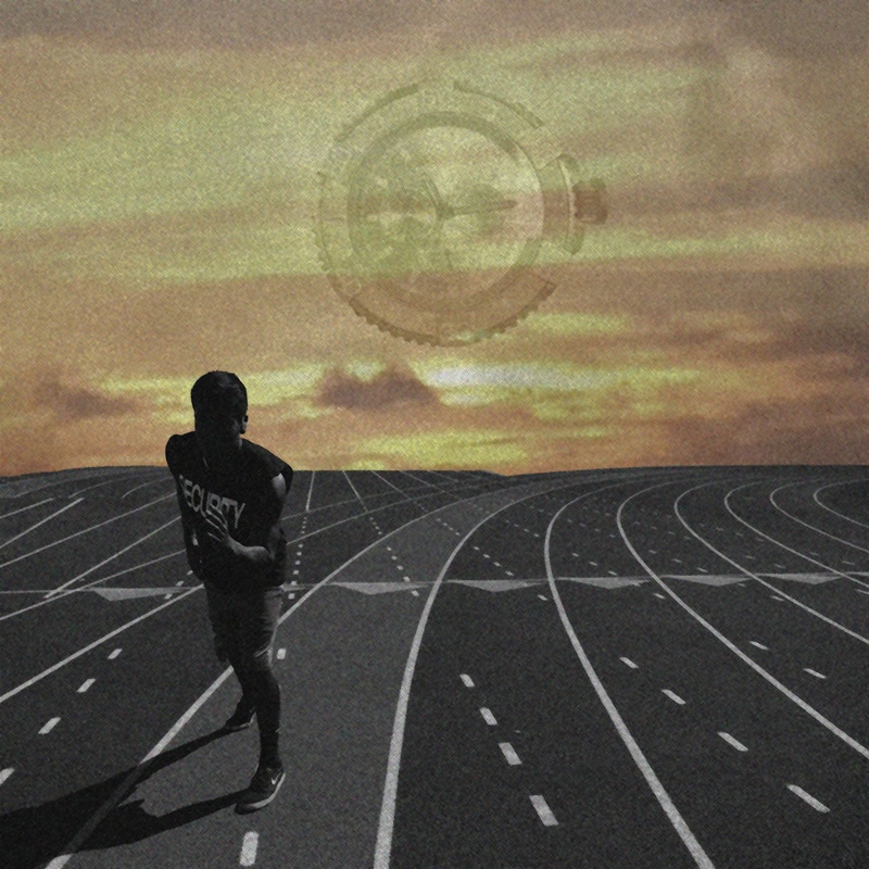 "She said I don't spend time like i really should... she said she don't know me, anymore" "I keep on running, keep on running, And nothing works, I can't get away from you" -Kid Cudi
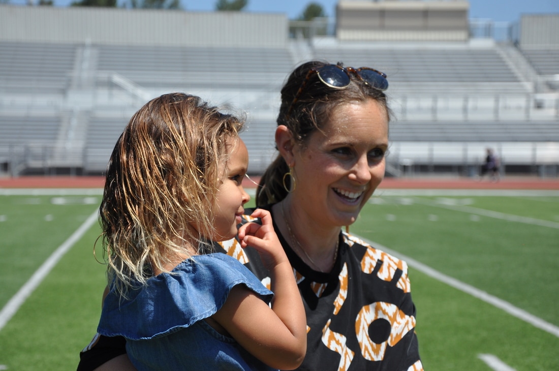
I decided to do these lyrics because i just can relate to it. Someone who spends a lot of my time fighting and training I really don't have time for anyone else. What i did was I placed the background first and then i entered another picture i took of clouds and put them together. Next i used an old pic of my friend running i took for Respect project and i edited out the back but kept the track because when on a track it doesn't end, you just keep on running and you get no where so its like you can't get away. Next I took a picture of my watch and placed the image and I added a layer mask and erased the entire background except the main part of the watch. I changed the opacity and placed it as in the middle as i could. Then i merged the layers and went to Filter, Filter Gallery, Then I added both color pencil and stencil. 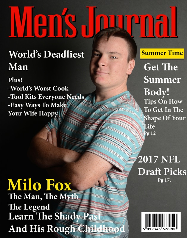 The magazine I used was Men's Journal because it was just natural and relaxed. It wasn't too serious or too boring. I used a mixed amount of examples from actual magazines to inspire and help with the design of the magazine. I used white to compensate to the dark background and yellow to stand out and to an odd extent it looks real. My set up was to look natural but like a boss. I did this because you can use it for anything and any scenario. What I used for the light was the strobe light that flashes the light because it is especially bright and creates a lighting specifically to your liking and the black side of the reflector to create shadows.
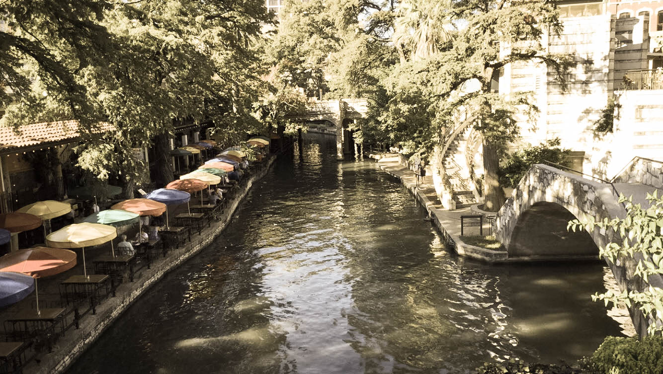
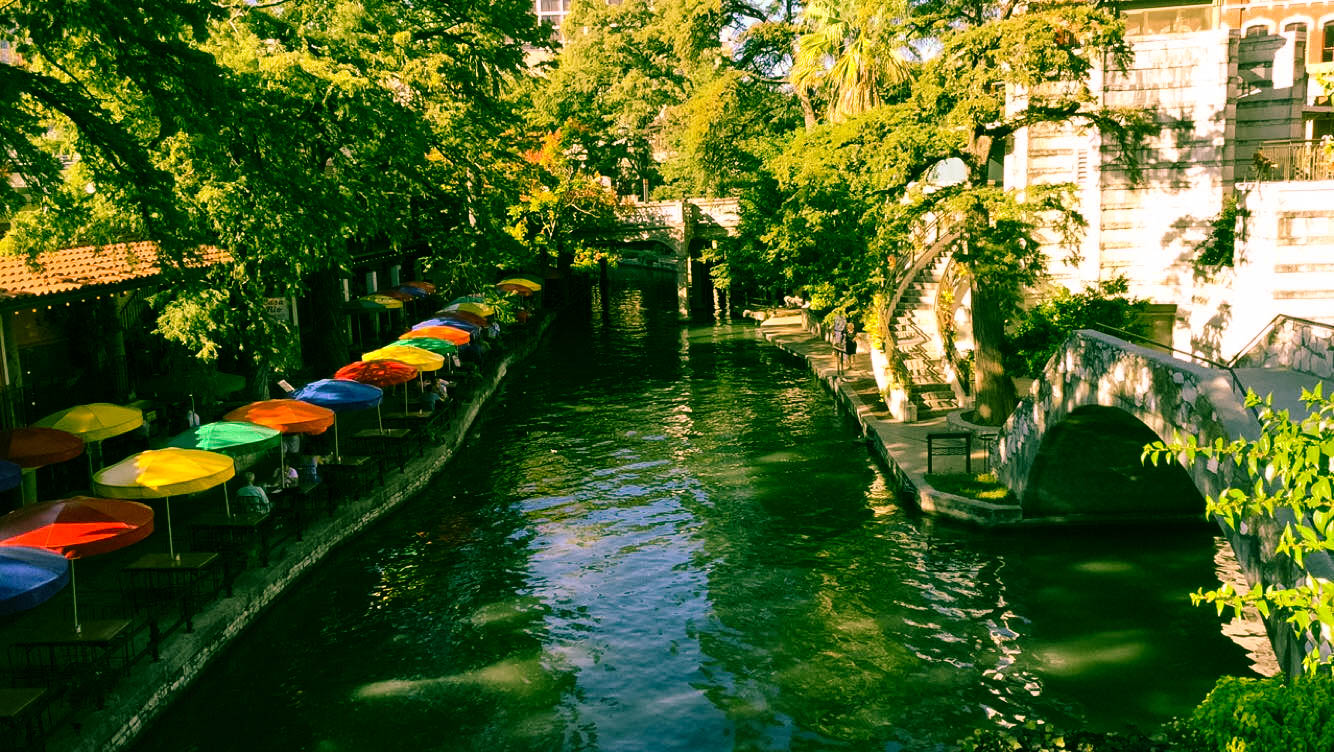
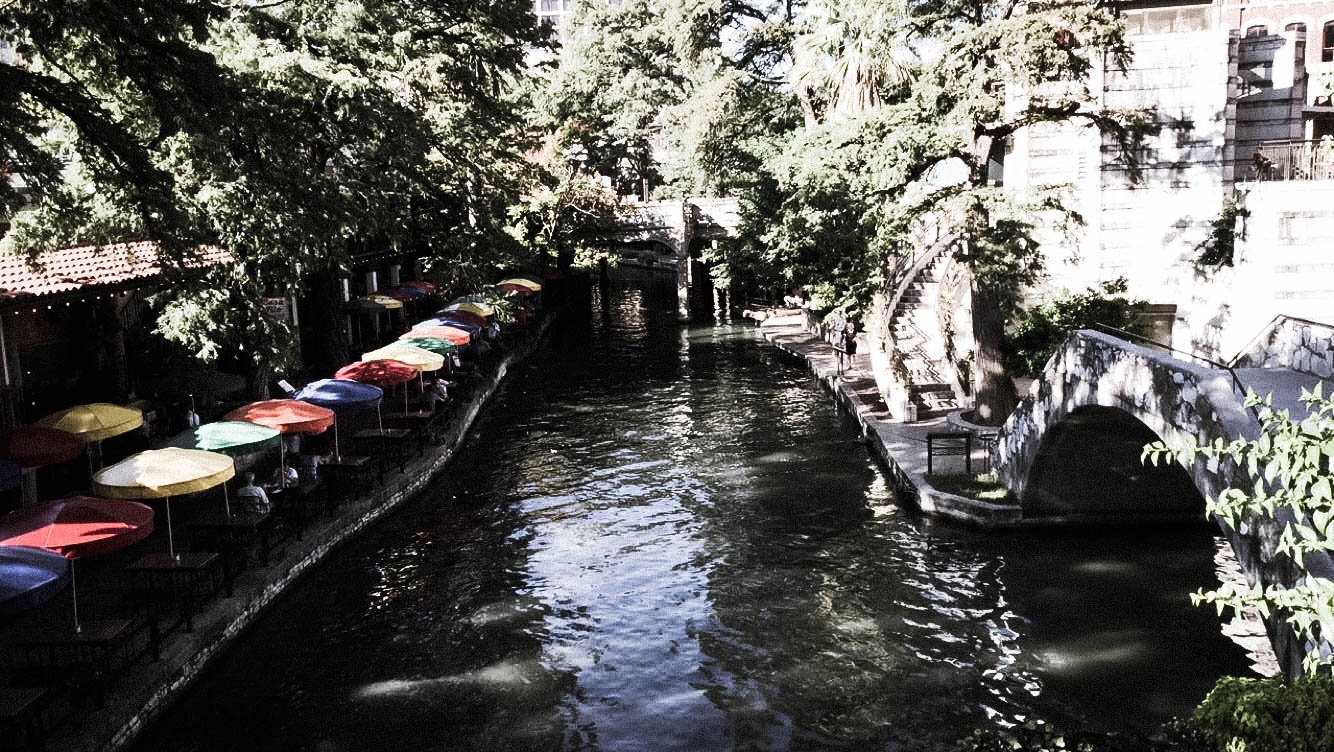
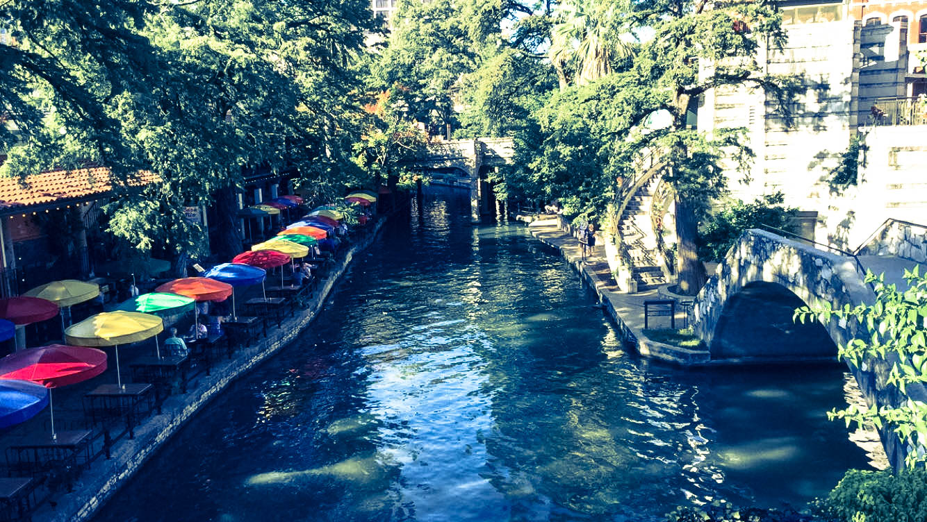
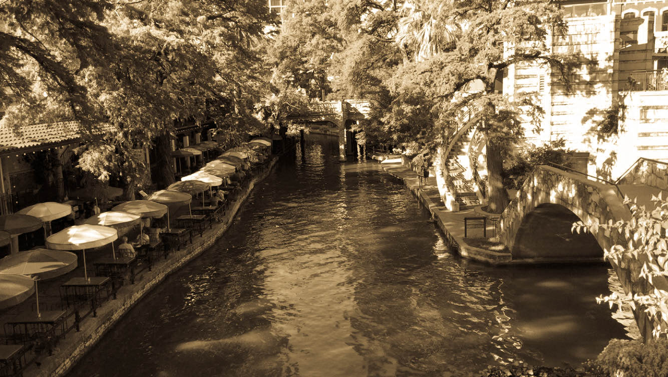
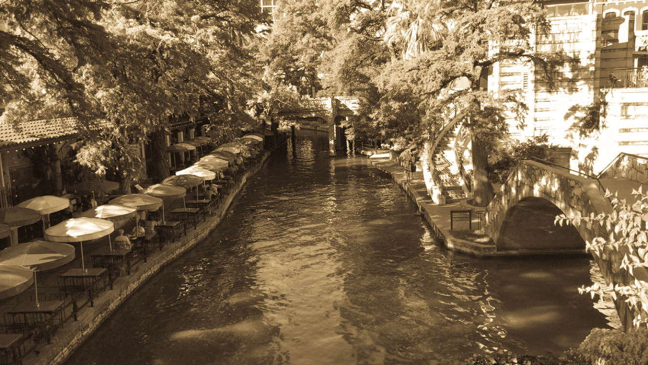
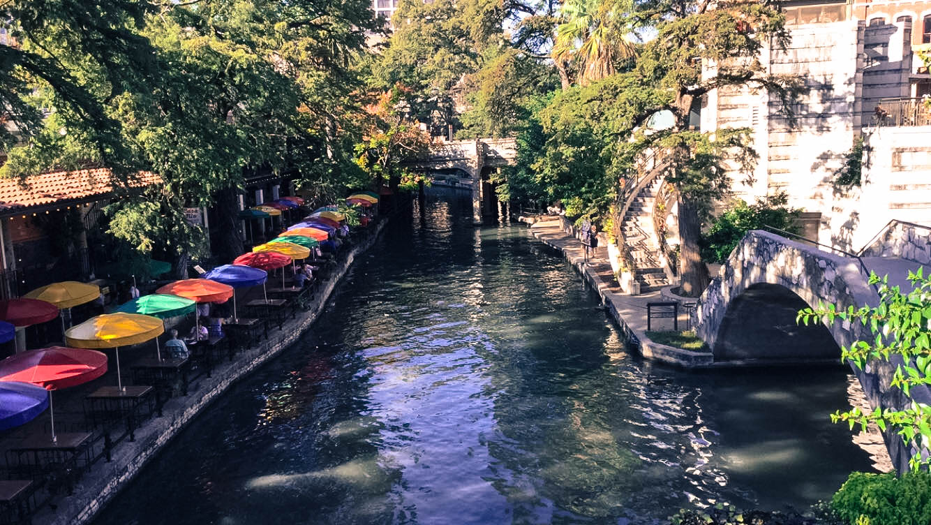
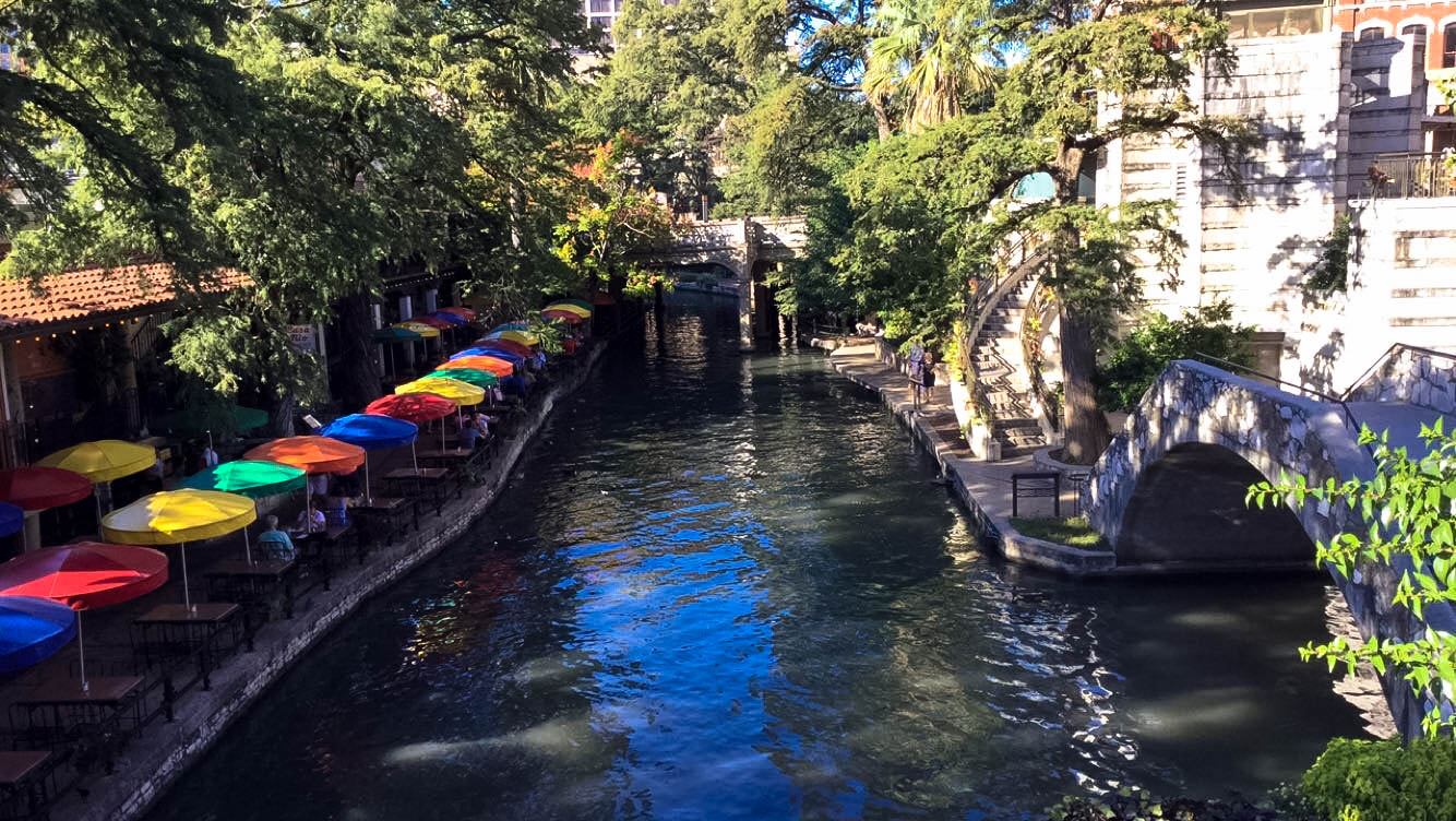
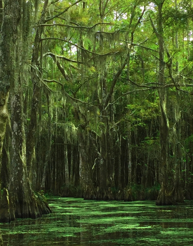 My name is Jacob Tatenco and I’m a student at RBV. This is my piece called “Swamp Fever”. Before I explain the name I must explain the story behind it. This picture means a lot because we went to Georgia to see my brother graduate from boot camp and since we were going to be there we might as well make it a 2-week vacation. So the destinations were Texas, Georgia, and New Orleans. This picture was taken in New Orleans and this picture means a lot to me because of how much is sacrificed and struggle my family went through to go on this trip to see my brother and this vacation. When we got to New Orleans my mother and sisters really wanted to go to the swamps first thing when we got to New Orleans. When on the tour I realized how beautiful a swamp can be and wasn’t the preconceived notion of an ugly, muggy, dirty place with a bunch of bugs. I wanted to capture the beauty it holds.
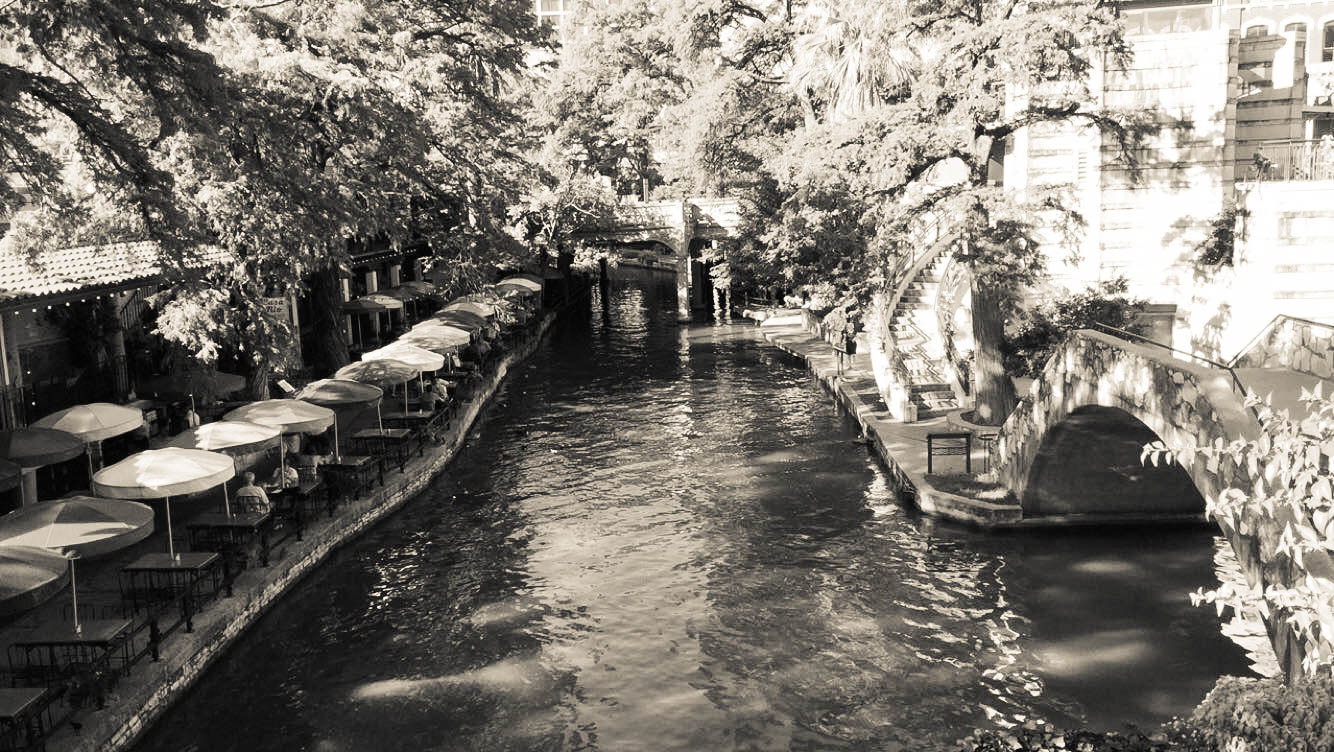
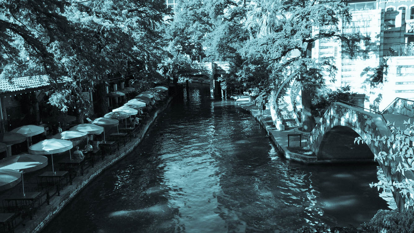
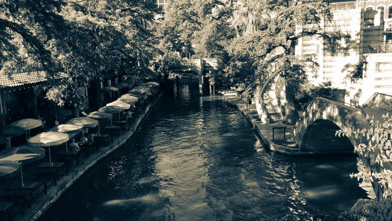
The compositional rule in my opinion is Rule of Thirds. The camera this was taken on was my Ipod touch. I used a little bit of Photoshop to edit the picture and improve lighting and picture quality. The division of this photograph can be either landscape or color. This is a very green picture and captures the pure and every shade of green, but it also captures the beauty of the swamp. This image was printed on Epson Glossy Photo Paper on the Epson P800 digital printer. |
AuthorMy name is Jacob Tatenco and I've always have had a vivid imagination. I got into photography to try my hand in it and as a small hobby. Archives
May 2017
|


 RSS Feed
Photo used under Creative Commons from ScottMPhotos1
